Nexa
EXPERTISE
Branding, visual identity, website
AREA
Technology
YEAR
2025
DESCRIPTION
Nexa is a tech startup manufacturing computers launching its first product, the Quantum, and is looking to develop a sober yet original visual identity reflecting its freshness and youth. In another hand, the company needs a website to promote its product and reach its target while optimizing the user experience. This project is conceptual.
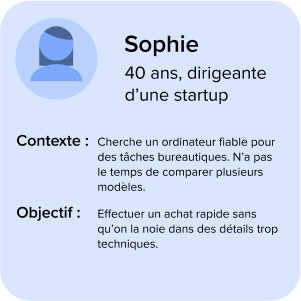
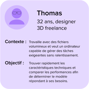
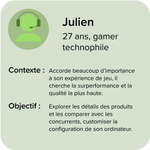
Understanding the users and their needs
The users have 3 main needs when they are using Nexa's website :
• clear and fast navigation without too many information
• highlighting performance without being too technical with the essentials
• personalization and suggestions based on the user's profile
These observations led us to creating 3 personas representing the whole target of Nexa.
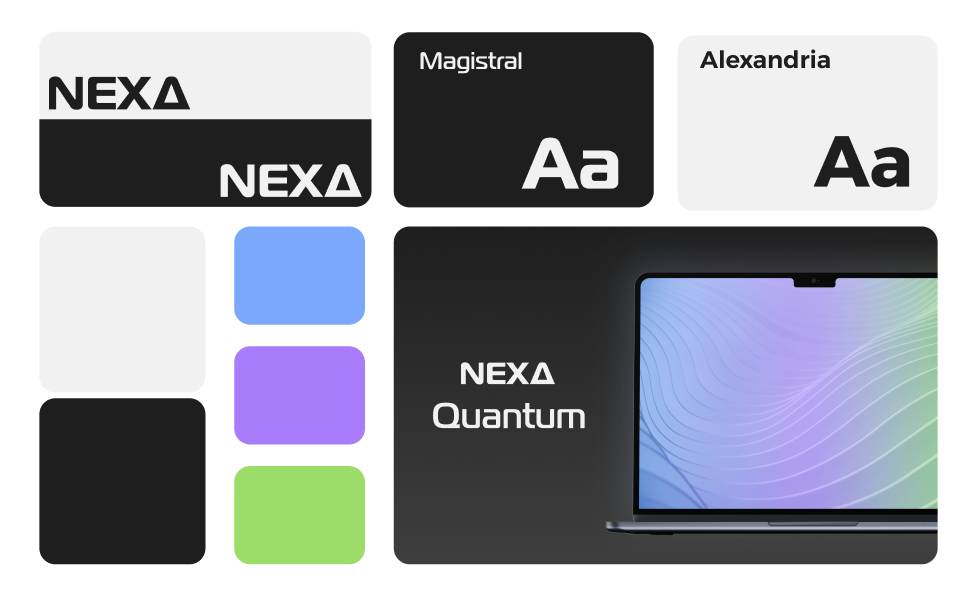
Visual identity
After identifying the target and their visual expectations for Nexa, we designed a visual identity representing the brand's value.
Structring information and goals
User path's structure of the website relies on 3 main pages :
• the homepage
• comparing models
• the product page
Main goals are :
• minimize the bounce rate on the homepage by attracting user's interest
• make a good transition between the product discovery and the conversion on the product page
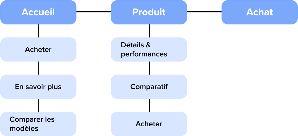
User path and first tests
Based on the information structure, we determined a scenario for each persona.
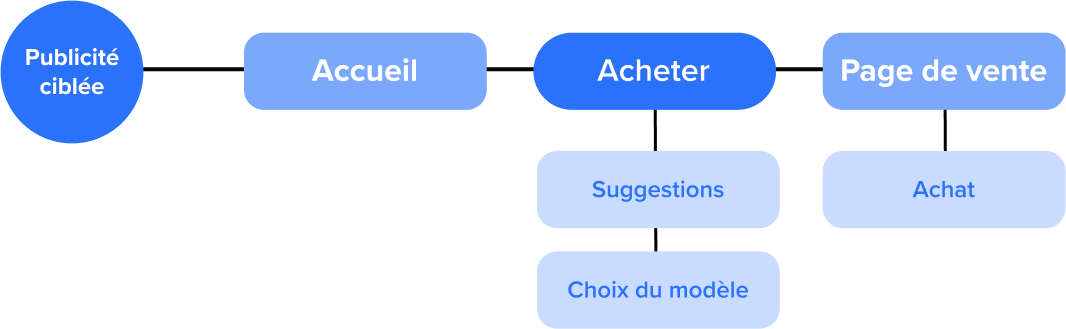
Scénario 1 : Buying quickly
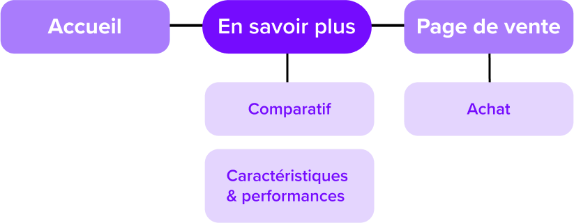
Scénario 2 : Comparing models
Scénario 3 : Customize the computer
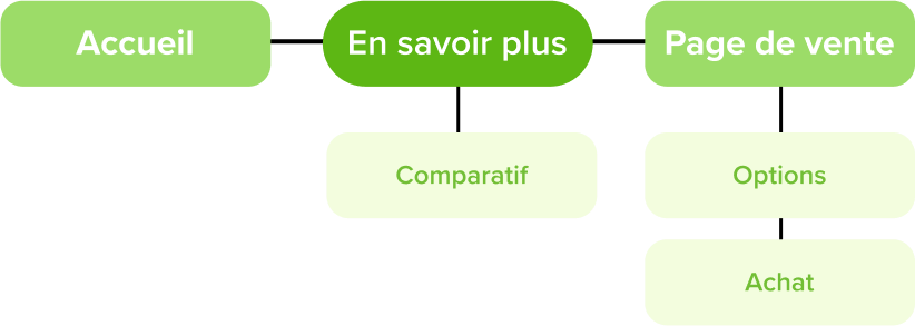
We then started the design phase with wireframes keeping in mind the idea of converging the interests of these different scenarios into a fluidized path that meets the needs of each user.
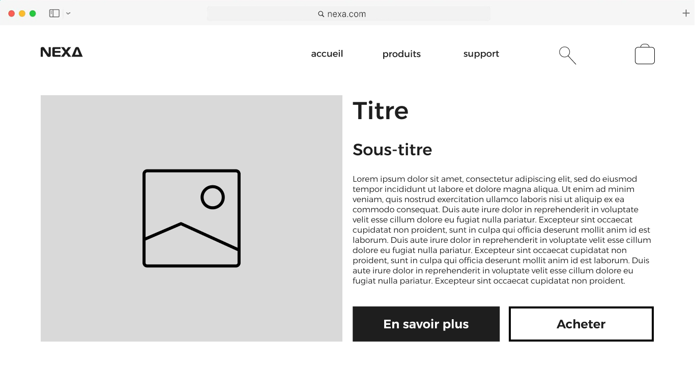
Version 1 : Learn more
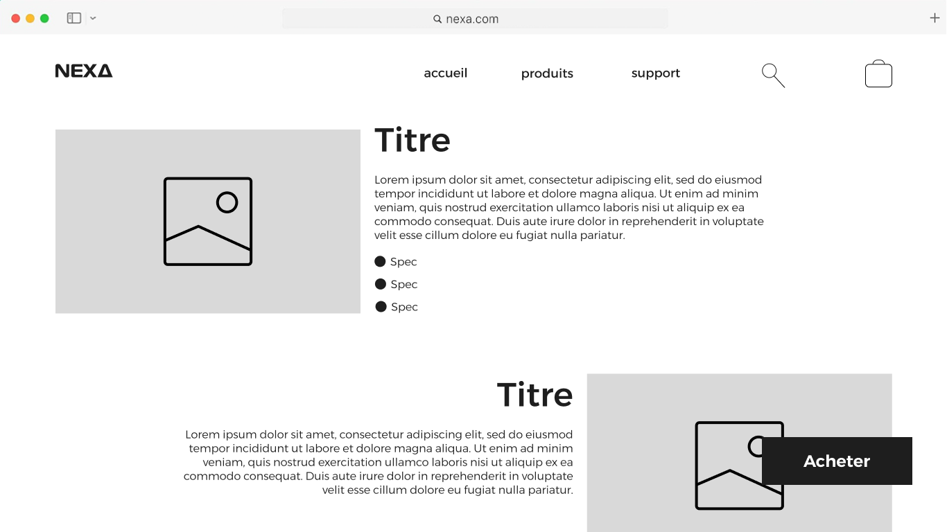
Version 2 : Comparing models
Designing a intuitive and immersive interface
Following the wireframes validations, we worked on the UI design in a minimalist direction, reinforcing the qualitative aspect of Nexa products, while carrying out regular tests to validate the design choices.
To add more dynamism to the interface, we added micro interactions and subtile animations reinforcing immersion and user experience.
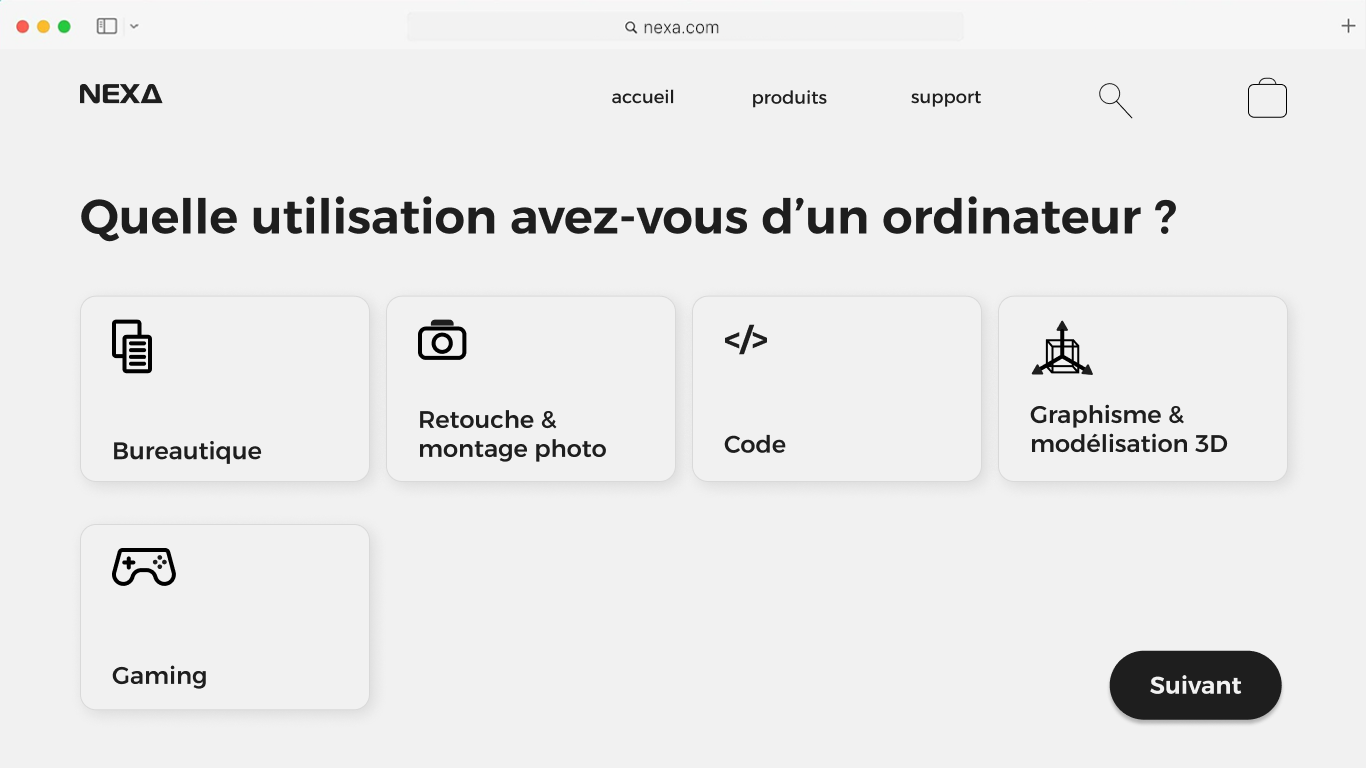
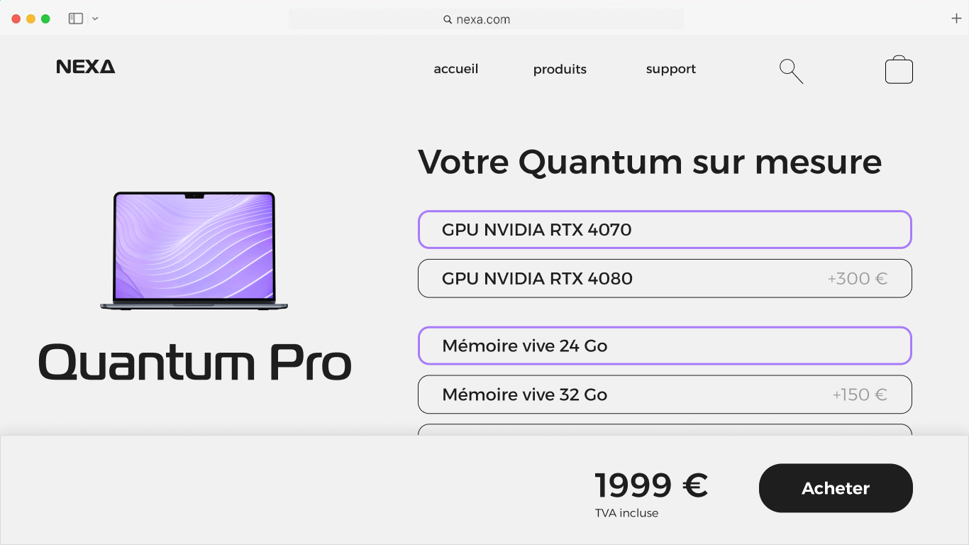
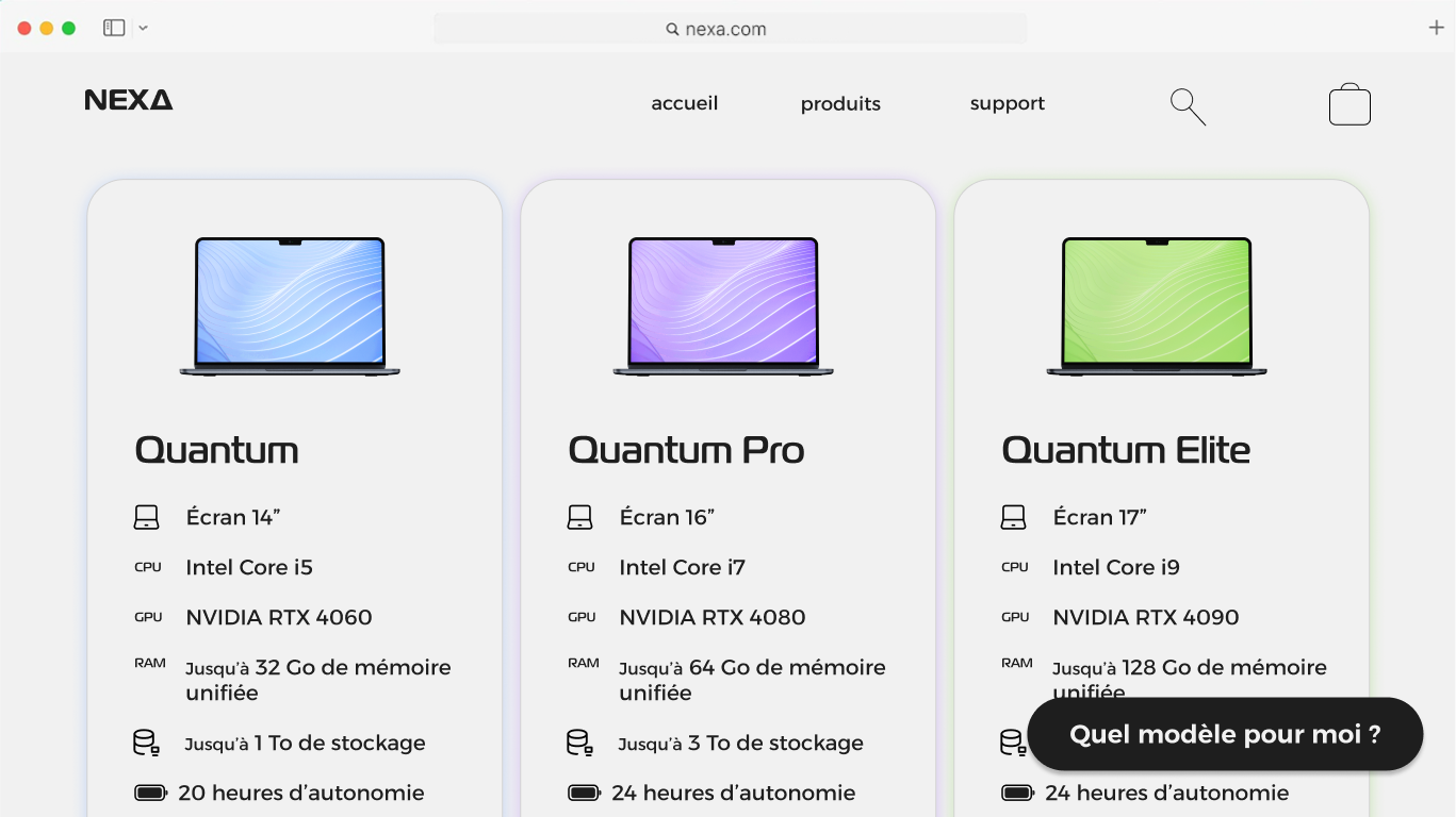
Customization and the "help me choose" section help create a intuitive and interactive experience : the user is an actor of his own purchasing experience.
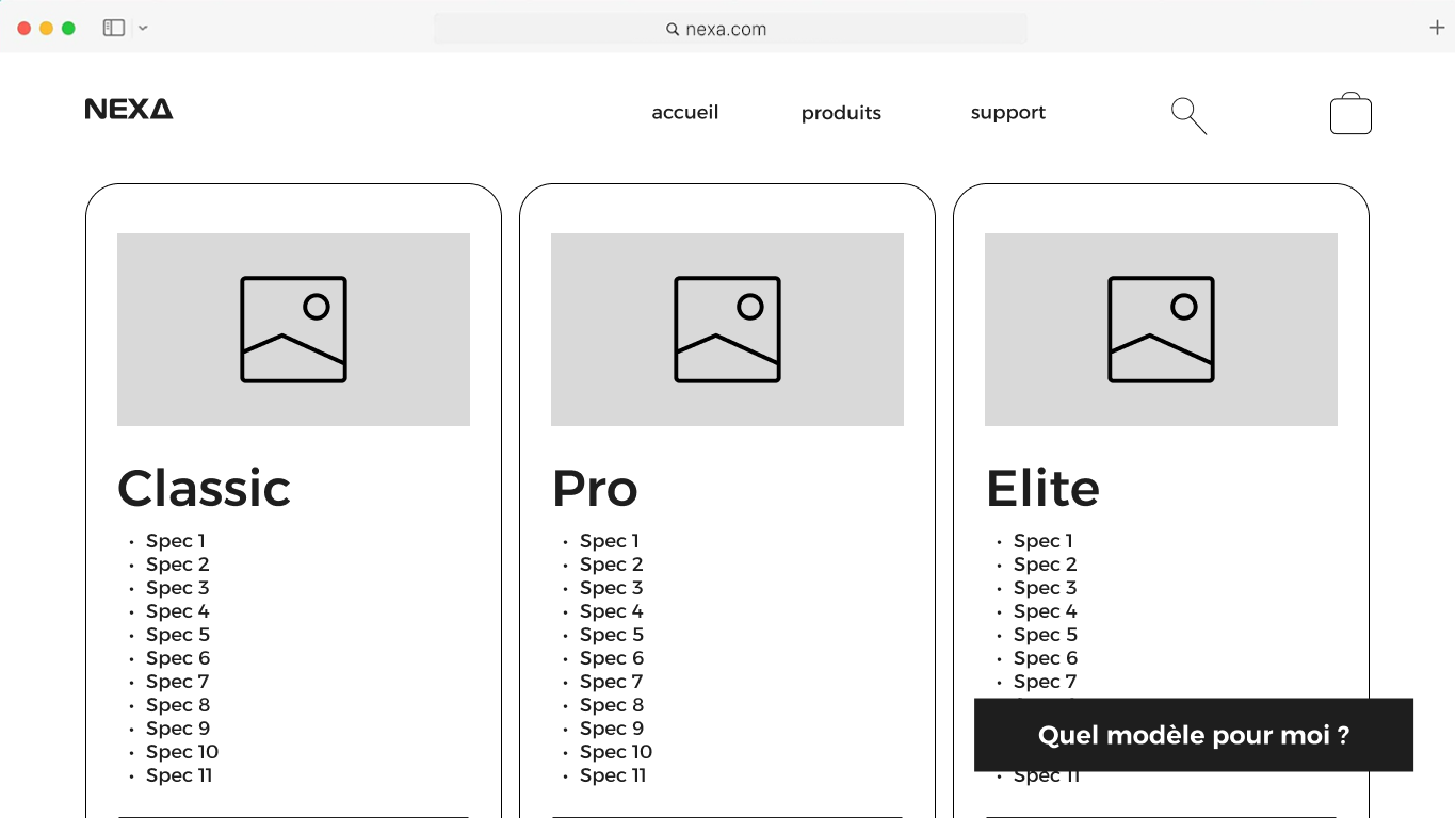
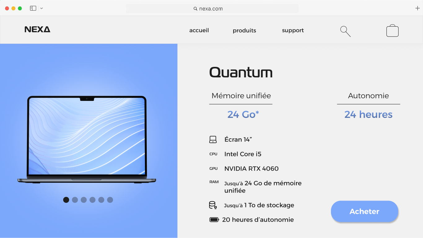
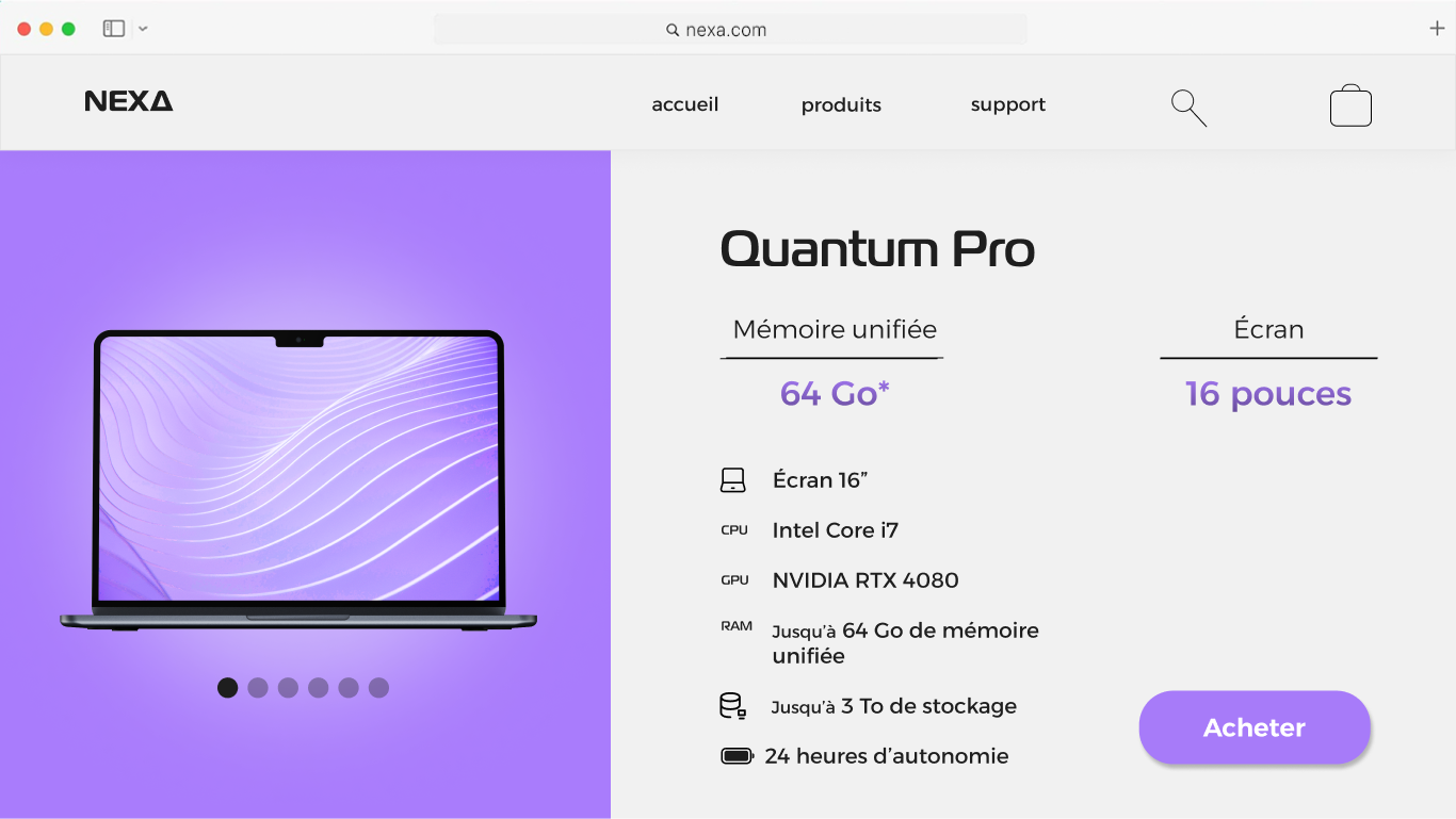
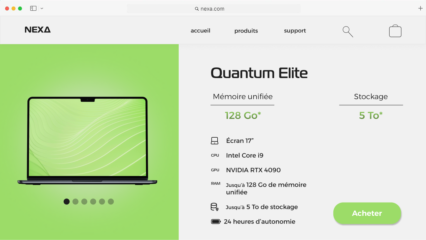
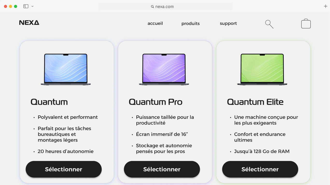
The interface is based on the segmentation of the 3 models to show the user that he has a large choice and that he will surely find what fits his needs.
Validate & iterate
By designing this website, we ensured that :
• the interface is intuitive
• the homepage has a good hook with the animation to attract user's interest
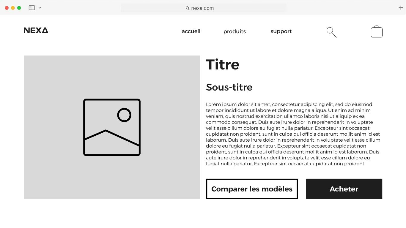
We then identified a problem related to the purchase page : a lack information to make sure that the model chosen is the good one, so we reworked the page and added 2 buttons «compare» and «learn more» leading to the product page.
Première version
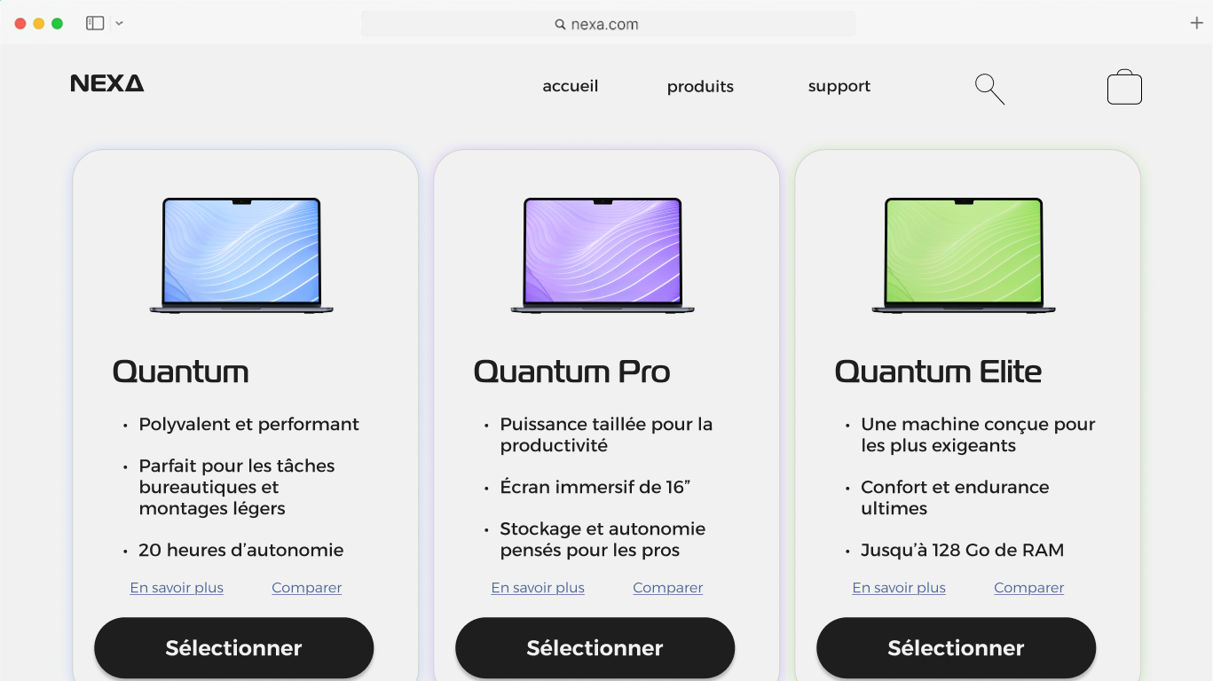
Version réajustée
Final result & impact
Keeping the design process user-centered throughout all the project timeline, we succeed in satisfying user needs :
• a fluid navigation that reduces friction points and an intuitive shopping experience
• an immersive experience strengthening brand a product perception
Conclusion
This project was very fulfilling and it has shown that keeping the user at the center of the design and reflexion throughout every phase is a good way to make sure that every decision made is solving the problem, which benefits to all the stakeholders.